
Design for Disruption | Capstone Project
This individual capstone project explores how transit riders navigate temporary service disruptions in downtown Calgary. Current disruption communication often relies on text-heavy alerts, address-based directions, and inconsistent on-site signage, making it difficult for riders to quickly understand where to go. The final design proposes an integrated digital and physical wayfinding system that supports clearer decision-making, visual guidance, and rider confidence in real-time conditions.
Role: Research, Information Design, UX/UI Design, Wayfinding, Prototyping, Usability Testing
The Problem
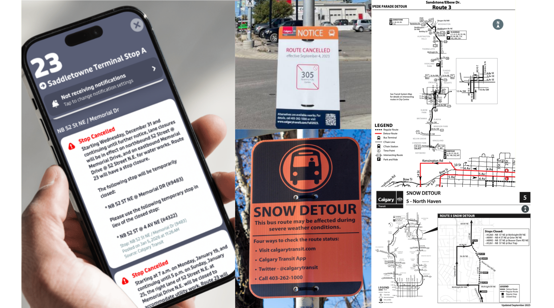
Transit disruption communication is not designed for real-world navigation. Riders are often presented with text-heavy alerts, address-based directions, and inconsistent or hard-to-find signage. These systems require users to mentally translate written information into physical movement, often while under time pressure.
As a result, riders frequently pause, second-guess their decisions, or rely on guesswork when navigating to temporary stops. This creates unnecessary cognitive load at critical decision points, especially for users who are unfamiliar with the area or navigating under stress.
View my project proposal here!
Context & Users
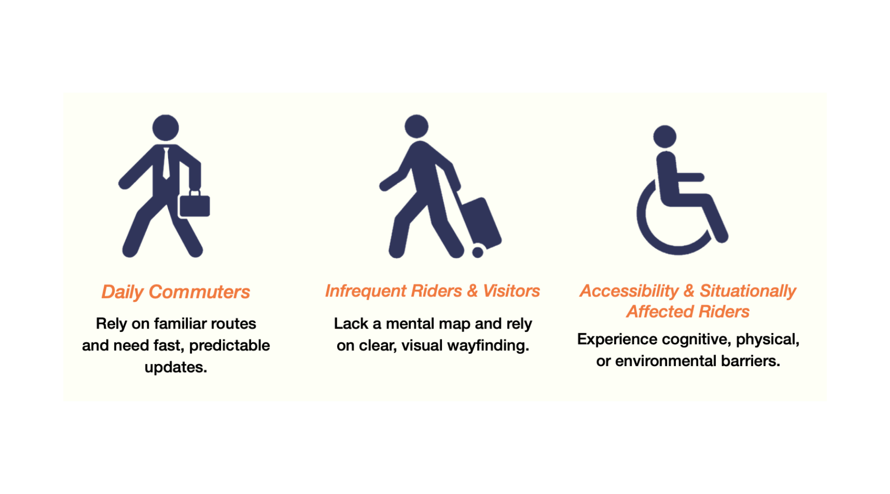
This system impacts a wide range of transit riders navigating dense downtown environments:
- Daily commuters, who rely on routine and need fast, predictable updates
- Infrequent riders and visitors, who lack familiarity with the area and depend on clear, visual guidance
- Accessibility and situationally affected users, who may experience cognitive, physical, or environmental barriers
Across all groups, disruptions introduce uncertainty that forces users to quickly reorient. What they need is immediate clarity, low-effort information, and reassurance throughout their journey.
Key Insight
Through observation and usability testing, I found that navigation during disruptions is not linear; it is non-linear, time-sensitive, and visually driven.
Rather than carefully reading instructions, riders scan their environment, look for landmarks, and move based on what feels most intuitive. They frequently switch between their phone and surroundings, using each to validate their decisions. When information is unclear or overly text-based, users hesitate, lose confidence, and rely more heavily on instinct than guidance.
This revealed a critical gap between how information is presented and how it is actually used in real-world conditions.
Design Approach
The design approach shifted from instruction-based communication to visual guidance, grounded in cognitive and information design principles.
Key considerations included reducing cognitive load, prioritizing recognition over recall, and supporting decision-making under time pressure. This meant simplifying information, strengthening visual hierarchy, and making key actions immediately visible and easy to follow.
Rather than asking users to interpret information, the system was designed to guide them through it.
The Solution
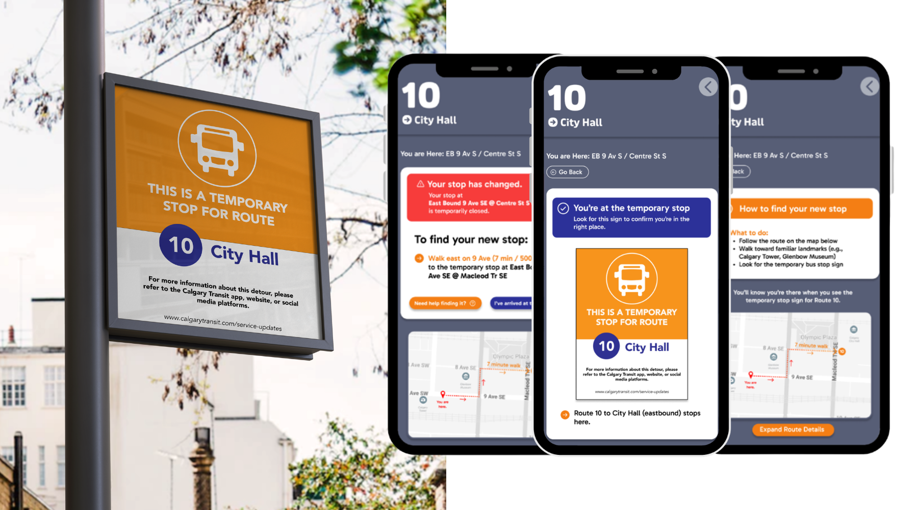
The final solution is an integrated wayfinding system that combines digital guidance with physical confirmation to support users throughout their journey.
The mobile experience provides clear disruption alerts, structured navigation guidance, and map-based route visualization. This helps users understand what has changed, where they need to go, and how to get there.
On-site signage reinforces this guidance by providing visible, recognizable confirmation at key decision points. By aligning digital and physical touchpoints, the system creates continuity, allowing users to confirm decisions in real time and navigate with greater confidence.
Check out my final solution in the Figma file below!
Testing & Insights
Usability testing was conducted with both information design and non-information design participants to understand how different users interpret disruption information.
Findings showed that users relied heavily on visual cues, maps, and landmarks when navigating, often prioritizing speed over accuracy under time pressure. While participants were able to identify key information, unclear instructions led to hesitation and reduced confidence.
Users also sought reassurance across multiple touchpoints, frequently cross-referencing between the app, signage, and their surroundings. This highlighted the importance of designing a system that supports both guidance and confirmation.
View my full prototype & testing document here!
Iteration
Initial prototypes focused on delivering written directions within a familiar app interface. While users were able to identify key information, testing revealed that instructions required too much reading and were difficult to act on quickly.
Based on these findings, the design evolved to include clearer step-by-step guidance, stronger visual hierarchy, map-based navigation, and confirmation states. These changes reduced cognitive effort, improved clarity, and better supported users in making fast decisions while in motion.
Final Case Study
View the final case study document here!
Impact
This system shifts navigation from interpretation to recognition, aligning with how users naturally process information in real-world conditions.
By prioritizing visual communication and reinforcing decisions across touchpoints, the design reduces cognitive load, improves clarity, and supports faster, more confident decision-making. It also provides a scalable approach that could be integrated into existing transit systems to improve the overall rider experience during disruptions.
Final Thoughts
This project highlighted the importance of designing for real-world behaviour rather than ideal user scenarios. Early designs relied too heavily on written instructions, but testing revealed that users depend on fast, visual cues when navigating under pressure.
Through iteration, the solution evolved into a system that better aligns with how people think, move, and make decisions in time-sensitive environments. This reinforced the value of grounding design decisions in user behaviour, not assumptions.