Neue Kabel Type Specimen Booklet
Typography is more than just letterforms; it is the foundation of visual communication. This project challenged me to explore the design and functionality of a typeface by developing a multi-page type specimen book. The objective was to research, analyze, and visually narrate the story of a chosen typeface while demonstrating an understanding of type hierarchy, grid structure, readability, and legibility.
The Process:
Typeface Selection: Neue Kabel
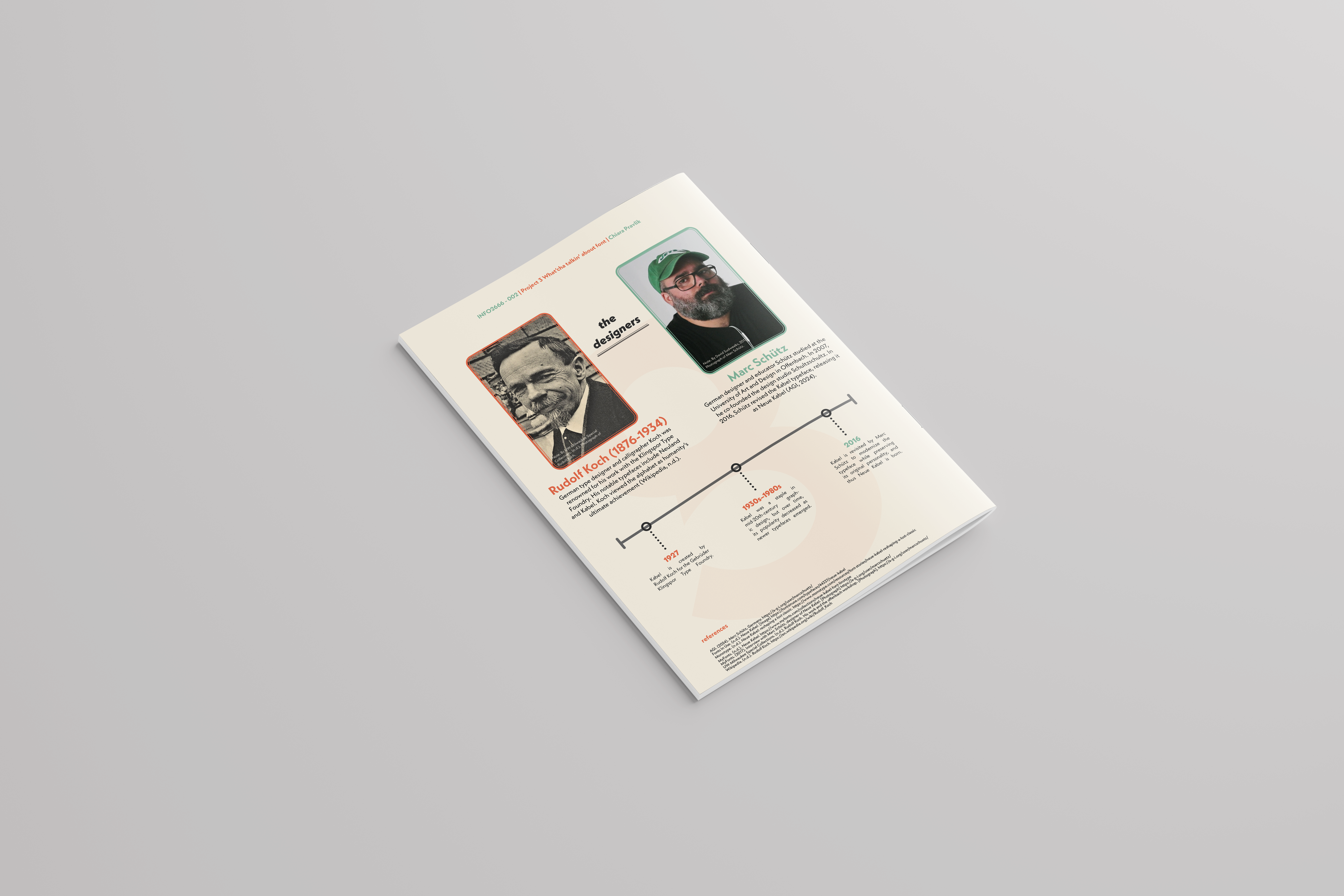
Neue Kabel, a modern revival of the original Kabel typeface designed by Rudolf Koch in 1927, was my typeface of choice. Its geometric yet quirky aesthetic made it a compelling subject for a specimen book. Marc Schütz redesigned Neue Kabel in 2016, refining its structure while preserving its original charm.
1. Research & Analysis
I began by researching the history, evolution, and applications of Neue Kabel. This involved examining its origins, typographic characteristics, and contemporary usage. I also studied historical type specimen books to understand how typography has traditionally been showcased.
2. Concept Development
The central theme of my book was the idea of personality in typography. Neue Kabel embodies a balance between geometric precision and playful humanist elements, making it both functional and expressive. I aimed to highlight this contrast through the design choices, including color, composition, and typographic hierarchy.
3. Layout & Grid System
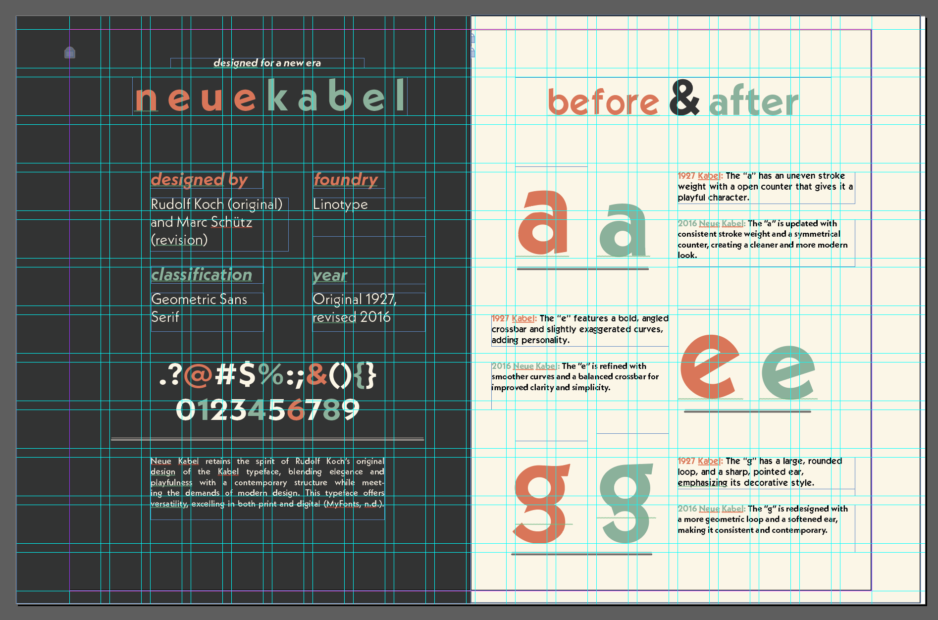
To maintain consistency and readability, I employed a structured grid system. The grid facilitated the organization of content, ensuring a cohesive balance between text, imagery, and white space. Each spread was carefully composed to guide the reader through the typeface’s characteristics without overwhelming them with information.
4. Typography & Hierarchy
Leveraging different weights and styles of Neue Kabel, I crafted a strong visual hierarchy. Key elements such as headings, subheadings, and body text were strategically arranged to emphasize the typeface’s versatility. This helped demonstrate how Neue Kabel functions in various contexts, from bold display typography to clean, legible body text.
5. Visual Elements & Composition
Color played a significant role in enhancing the book’s personality. I opted for a muted pastel palette, complementing Neue Kabel’s refined yet lively nature. Additionally, I included:
-
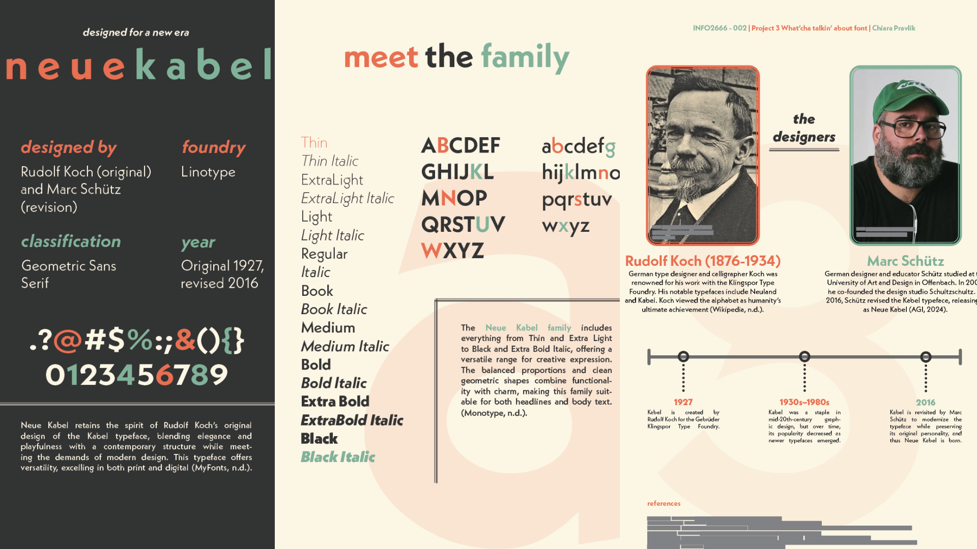
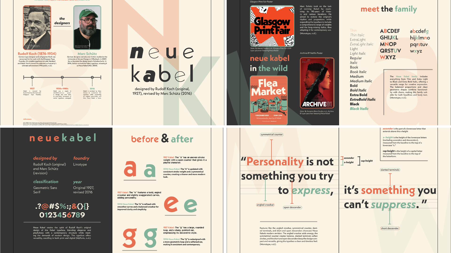
A showcase of Neue Kabel’s glyphs and stylistic variations.
-
“Meet the Family” spread displaying different weights and styles.
-
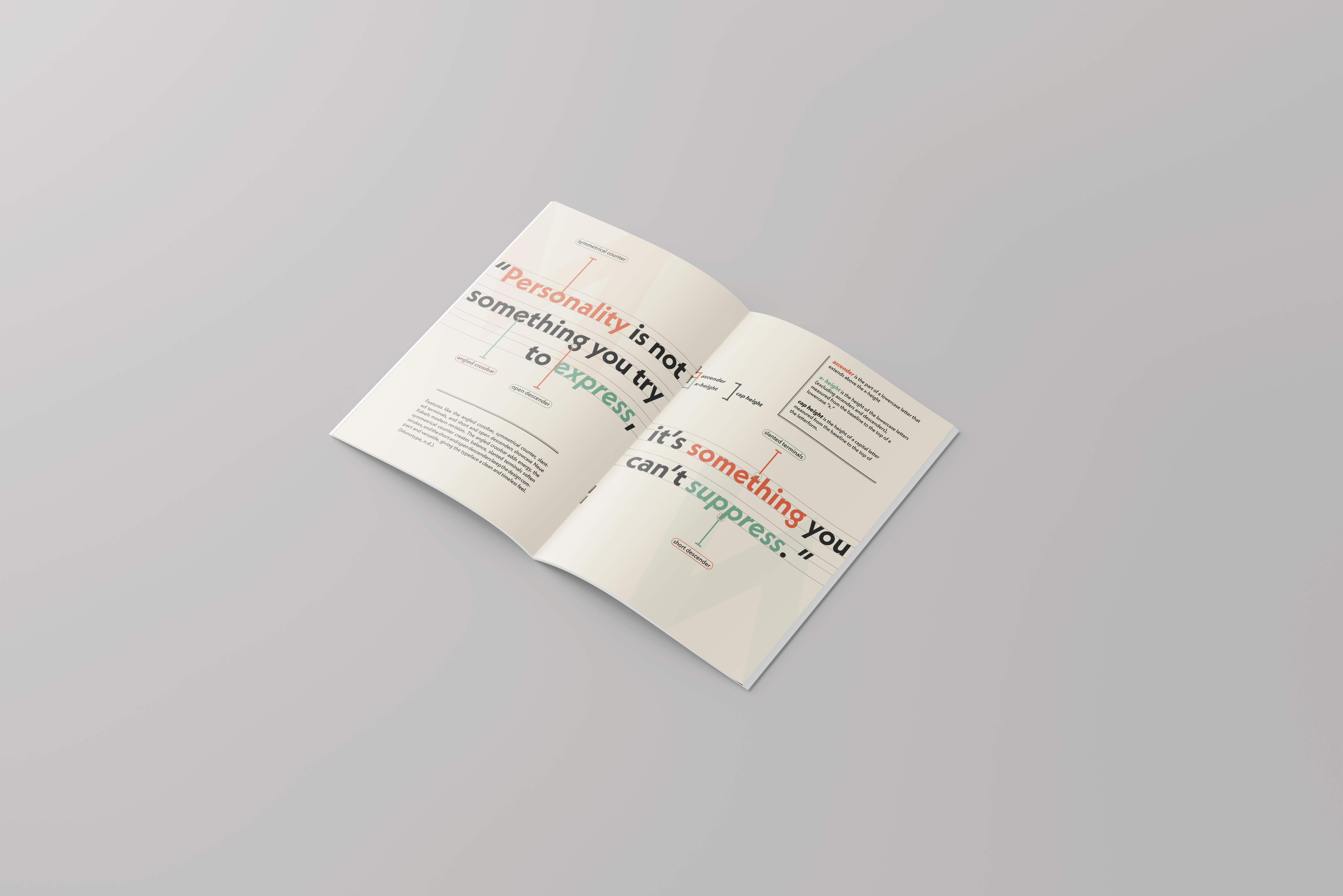
A typographic poster spread incorporating a notable quote.
-
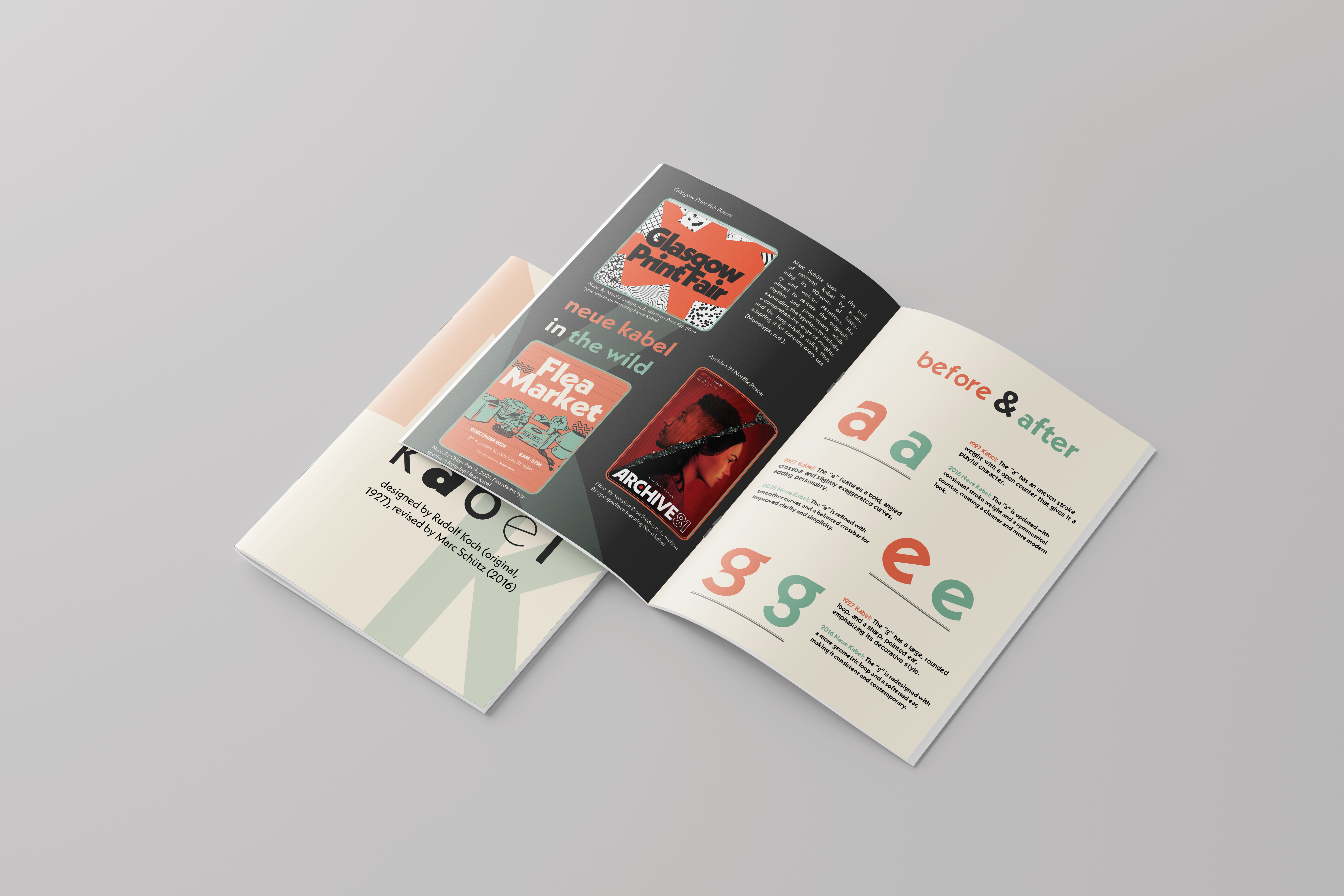
A comparison of Neue Kabel to its original counterpart, highlighting refinements.
-
Real-world applications showing Neue Kabel in use across branding and editorial design.
Final Product:

Results and Impact
The type specimen book effectively communicates the character and versatility of Neue Kabel, serving as both an educational resource and an engaging design piece. Through the process, I strengthened my skills in typographic storytelling, hierarchy, and grid-based layout design.
This project also reinforced the importance of research-driven design, ensuring that every visual choice was informed by historical and contextual understanding. The final outcome demonstrates how typography can be both structured and expressive, making it a valuable reference for designers exploring the balance between aesthetics and functionality.
Key Learnings
-
The importance of research in understanding typefaces beyond aesthetics.
-
How a well-defined grid system enhances readability and organization.
-
The role of hierarchy in guiding user engagement with a typographic layout.
-
The balance between function and expression in typography.
This project was an exciting deep dive into type design, reinforcing my ability to work with typography in a structured, meaningful way. It also allowed me to merge analytical research with creative execution, a skill set I continuously refine in my design practice.
