Victoria Park: Community Identity System
In this individual project, I developed a cohesive visual identity system for Victoria Park and applied it across print and digital formats, including a community newsletter, website mockup, and infographic poster—highlighting the neighbourhood’s history, culture, and revitalization.
Role: Designer, Researcher, Writer
Tools: InDesign, Miro, Adobe Illustrator, Wix
The Process:
1. Community Research and Strategy
To begin, me and my team of 4 conducted background research on Victoria Park, a historic inner-city neighbourhood in Calgary. We examined:
1. Demographics and local history
2. Existing businesses, amenities, and cultural landmarks
3. Tone and visuals from existing Calgary community branding
4. Stakeholder needs, such as attracting new residents, promoting small businesses, and unifying the neighbourhood’s visual presence
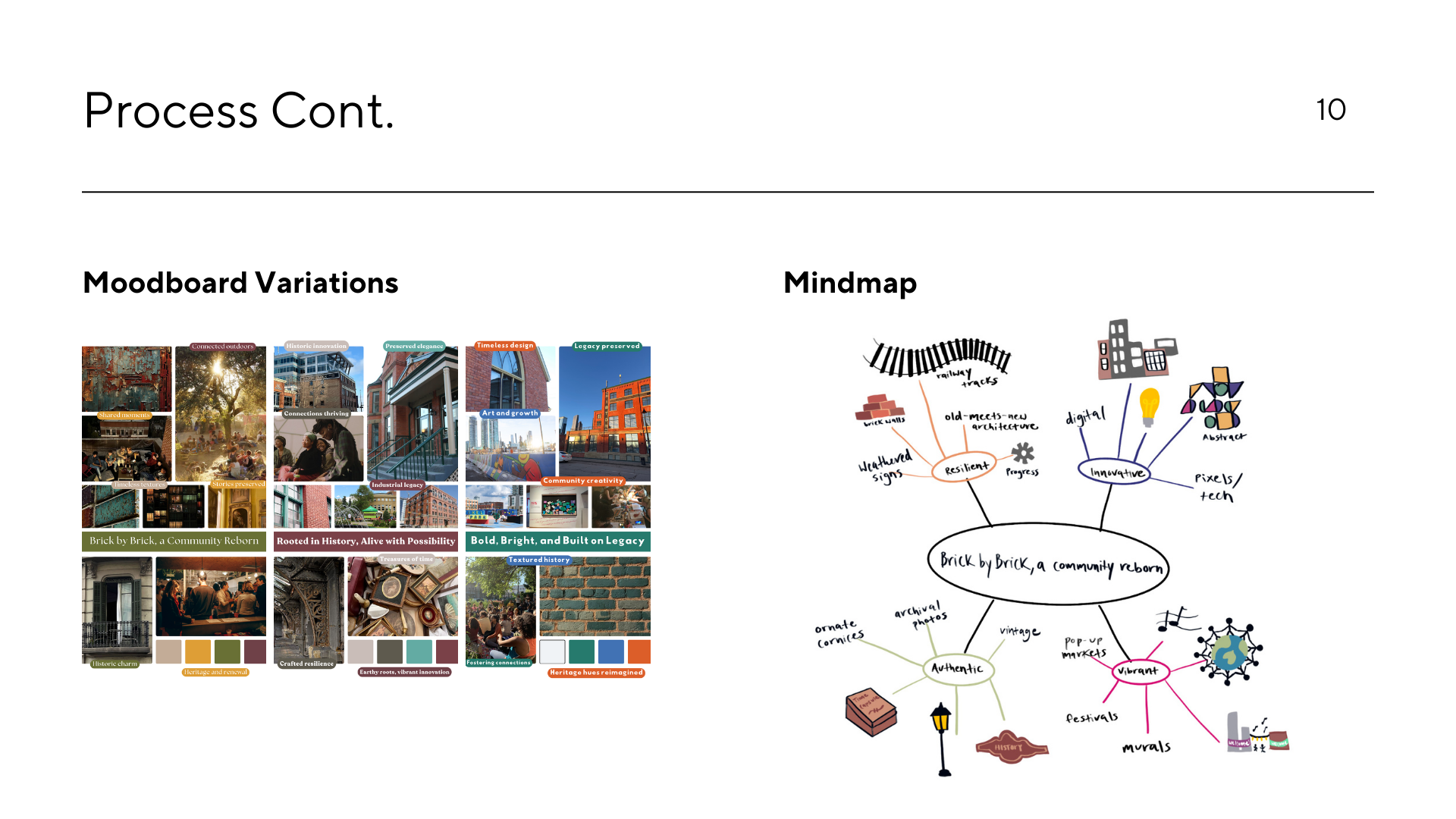
This informed the tone, messaging, and design language I would later develop. To view our research, click the image below!
2. Identity System Development
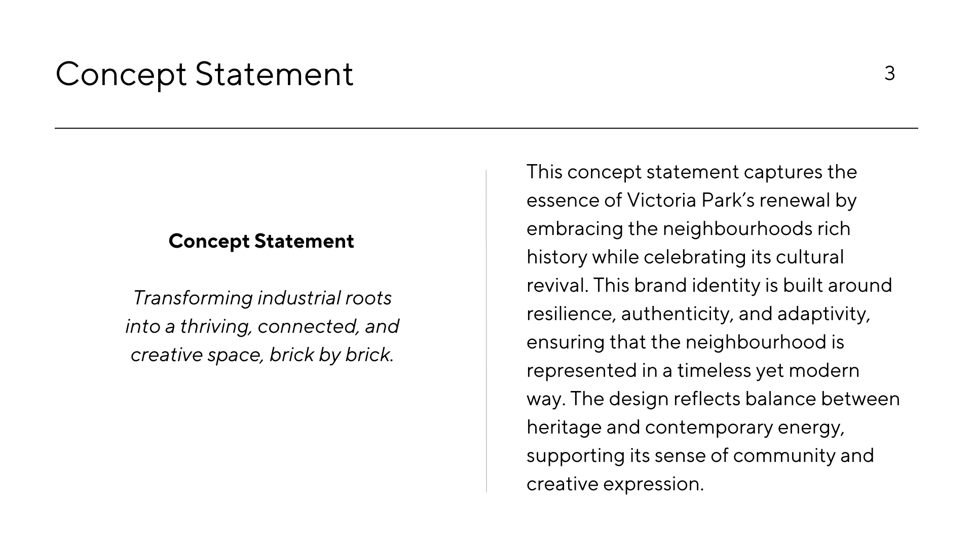
Using insights from ethnographic and visual research, I developed a cohesive visual identity system for Victoria Park that reflects its transformation from industrial roots into a thriving, connected, and creative neighbourhood.
Key elements include:
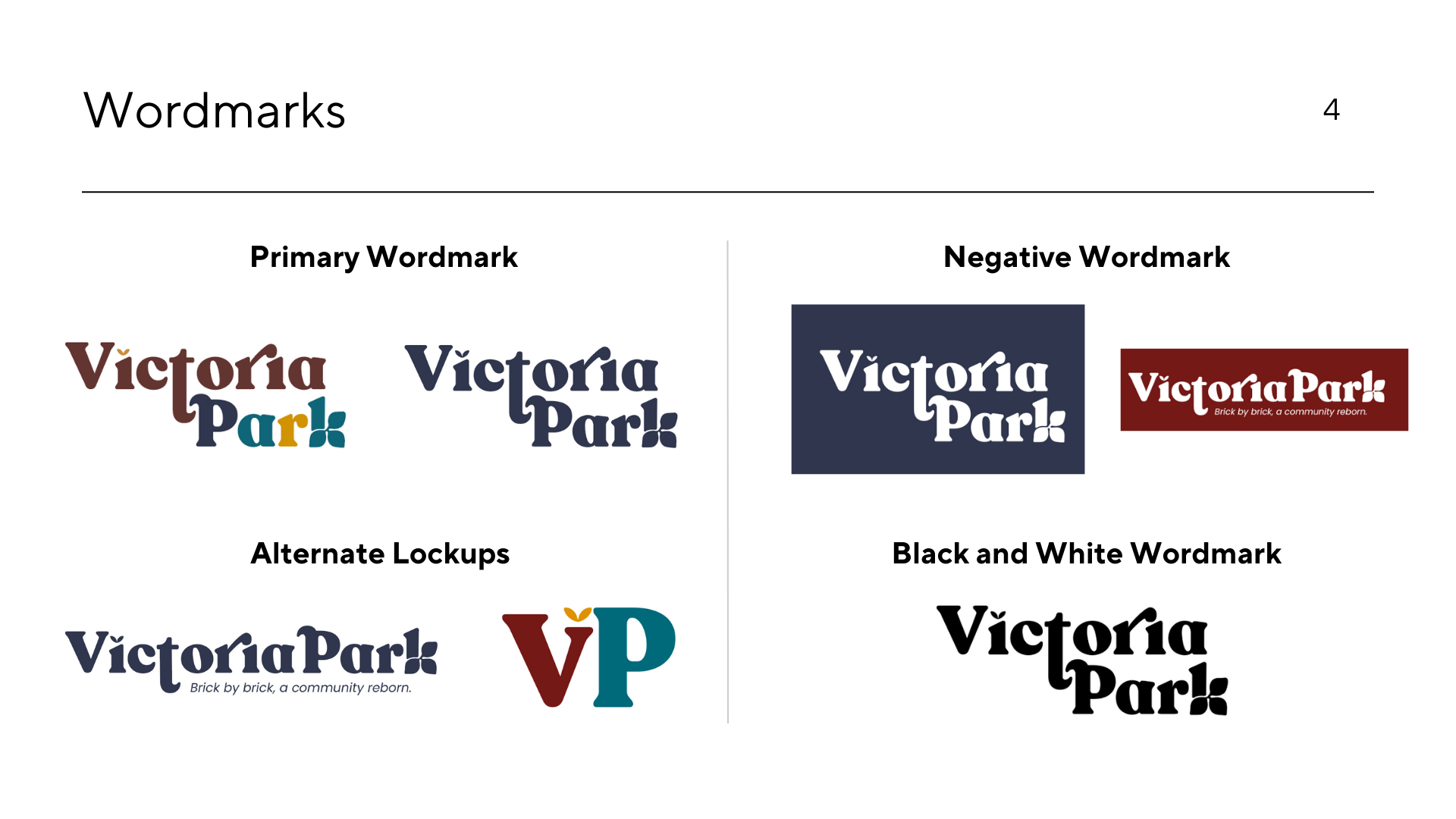
Wordmark: A bold, contemporary serif with exaggerated forms and varied letter widths, inspired by vintage signage and modular brickwork to reflect the neighbourhood’s layered personality and ongoing transformation.
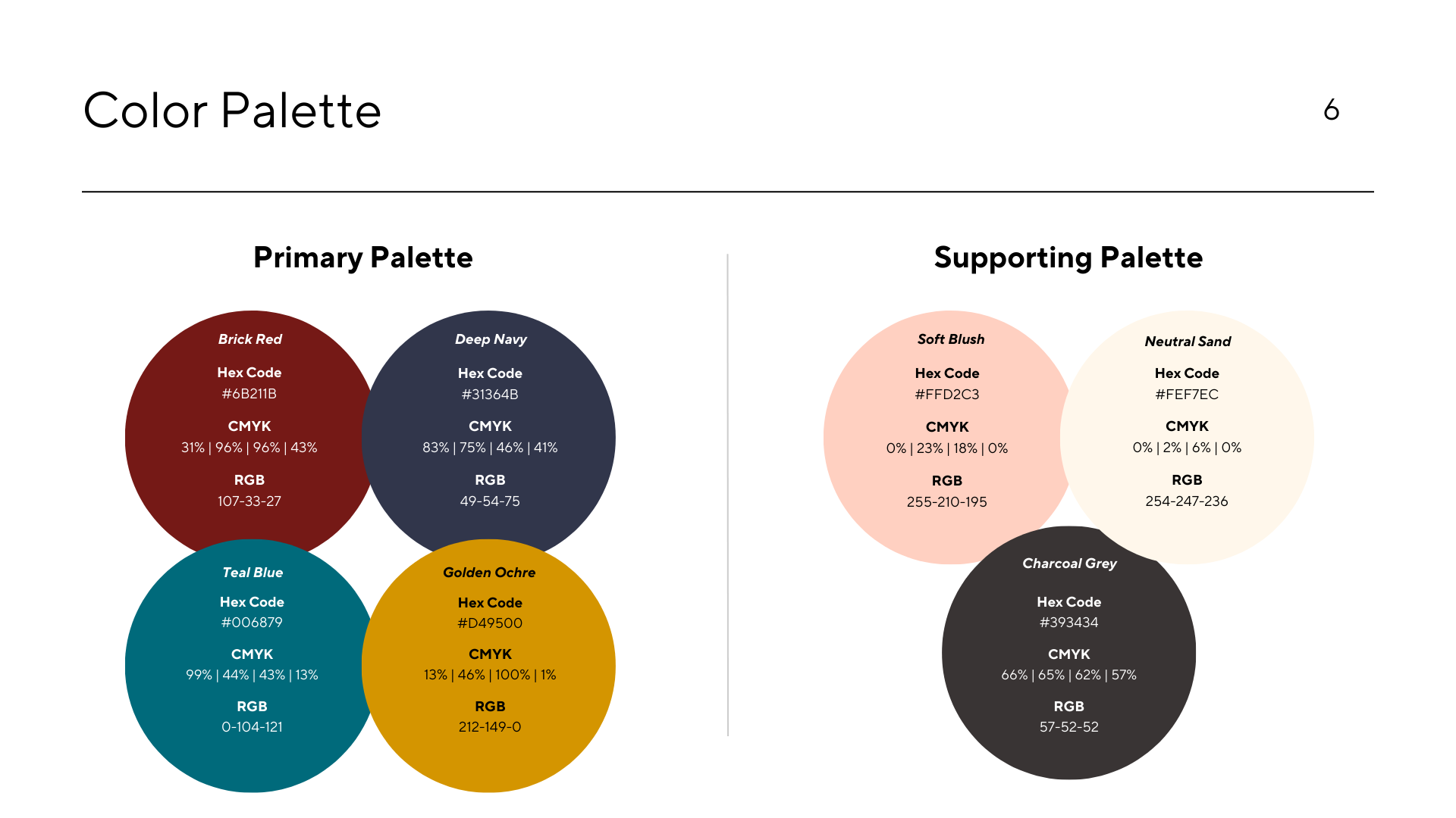
Colour Palette: Earthy reds, deep navy, and golden ochre to reflect history, vibrancy, and energy
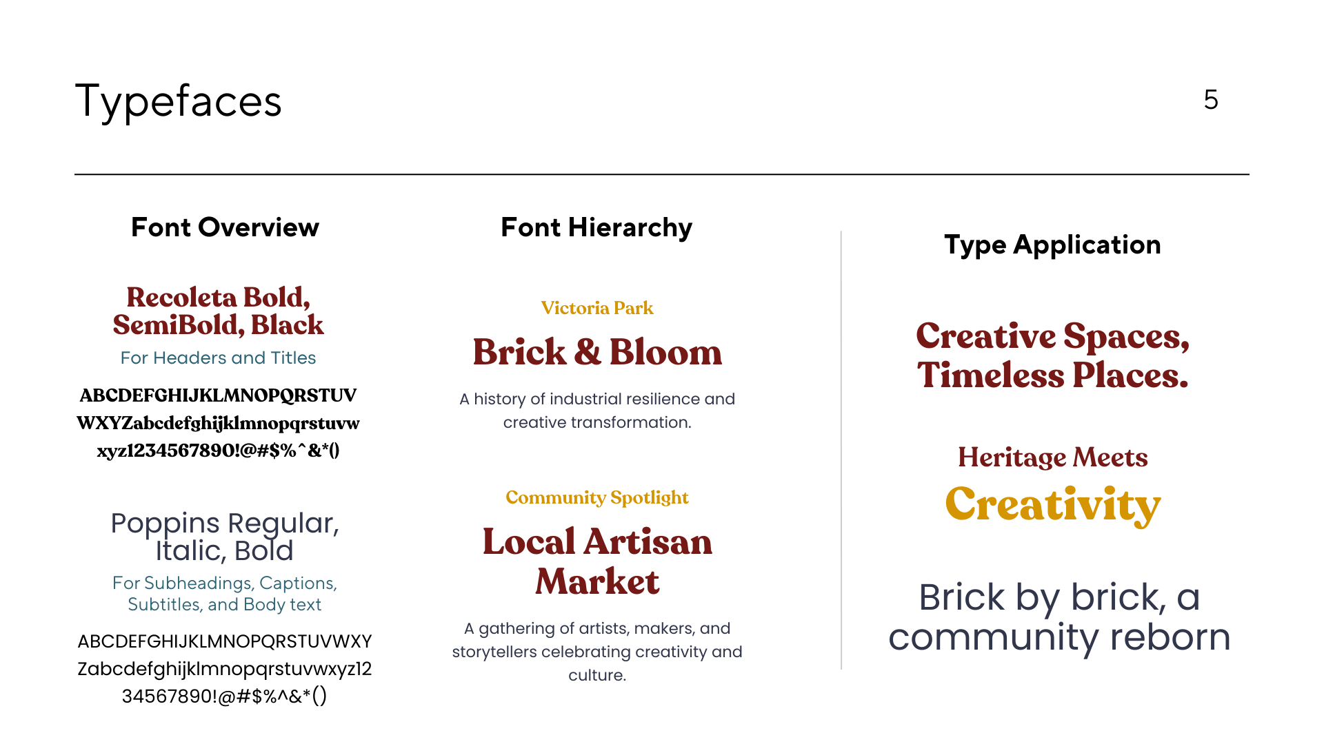
Typography: Recoleta and Poppins used to strike a balance between expressive character and clear communication
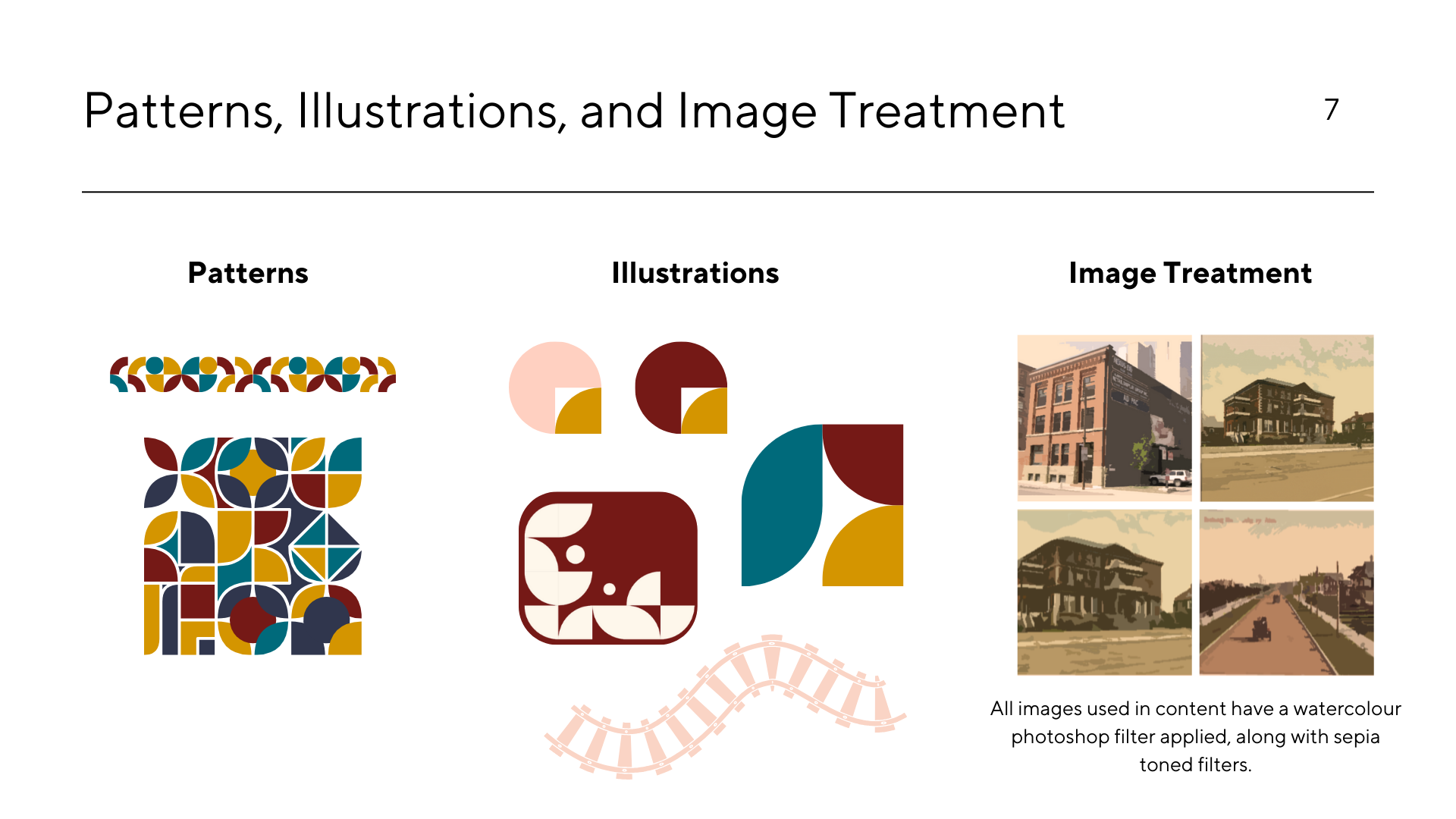
Graphic Language: Botanical illustrations, geometric patterns, and a sepia-toned image treatment reflect the area’s ongoing growth and layered identity


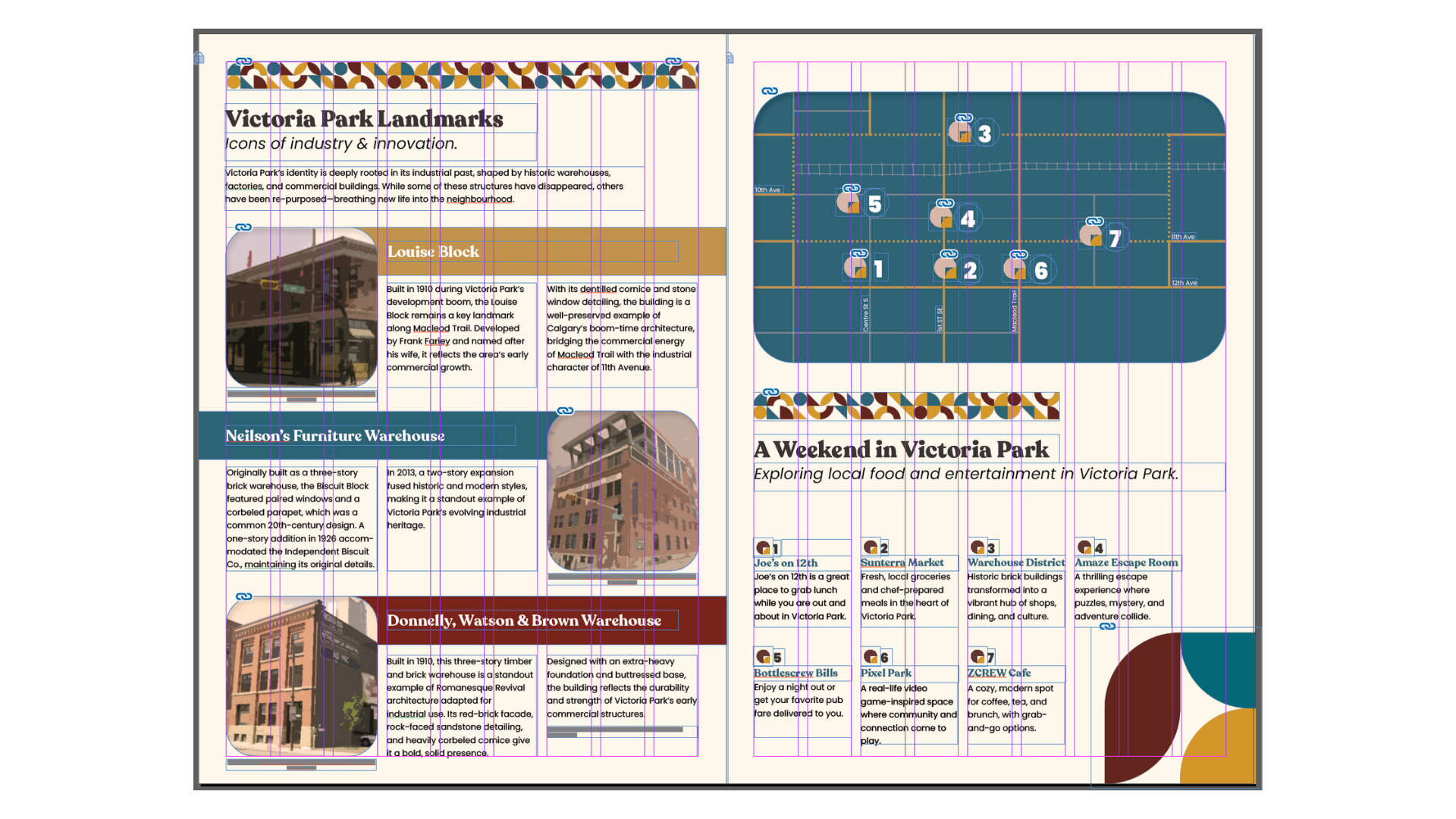
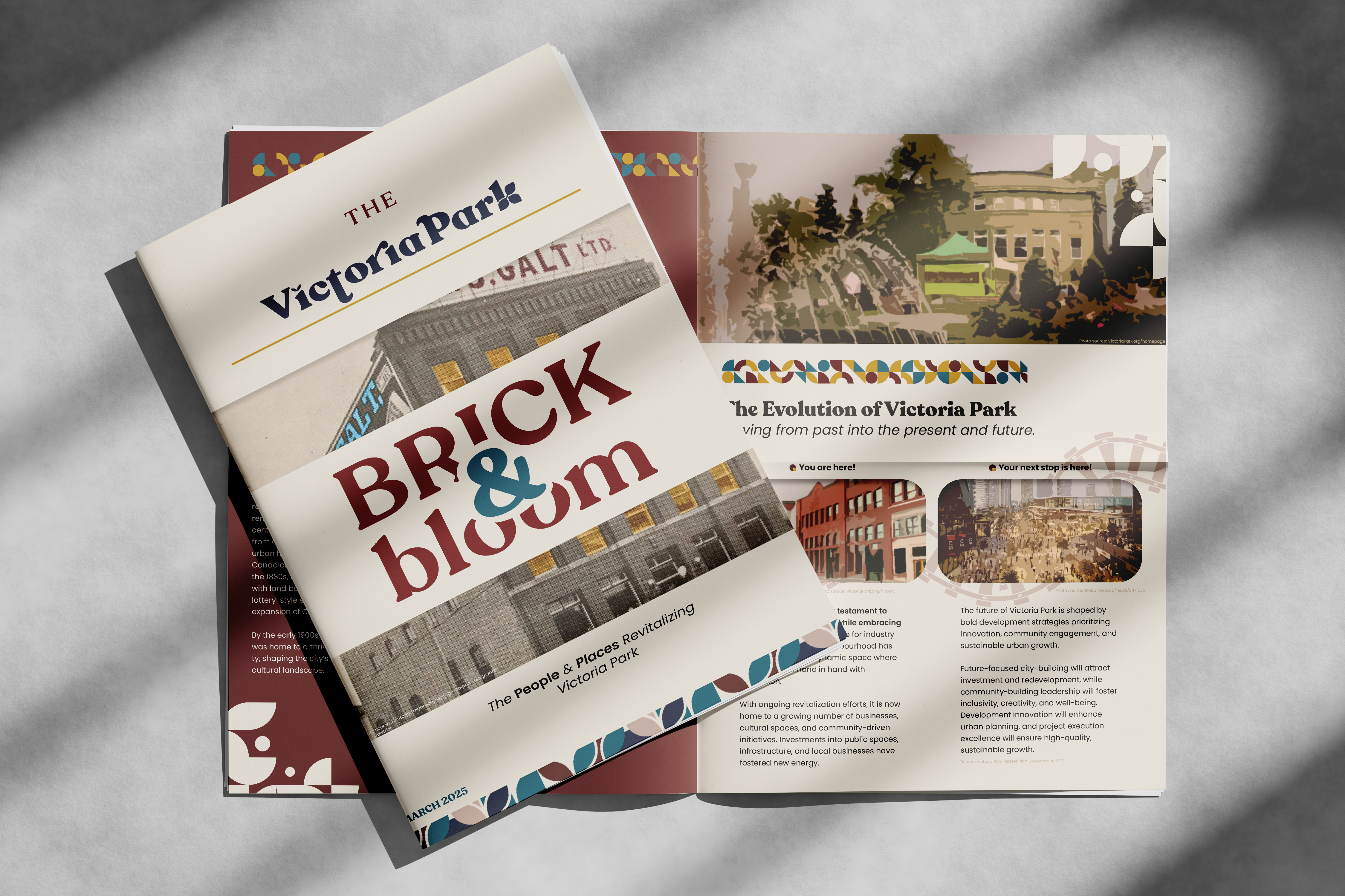
3. Community Newsletter (6-page layout)
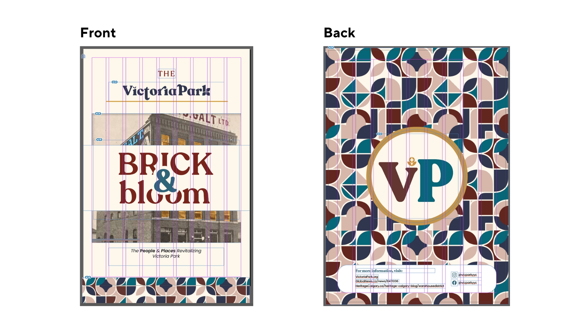
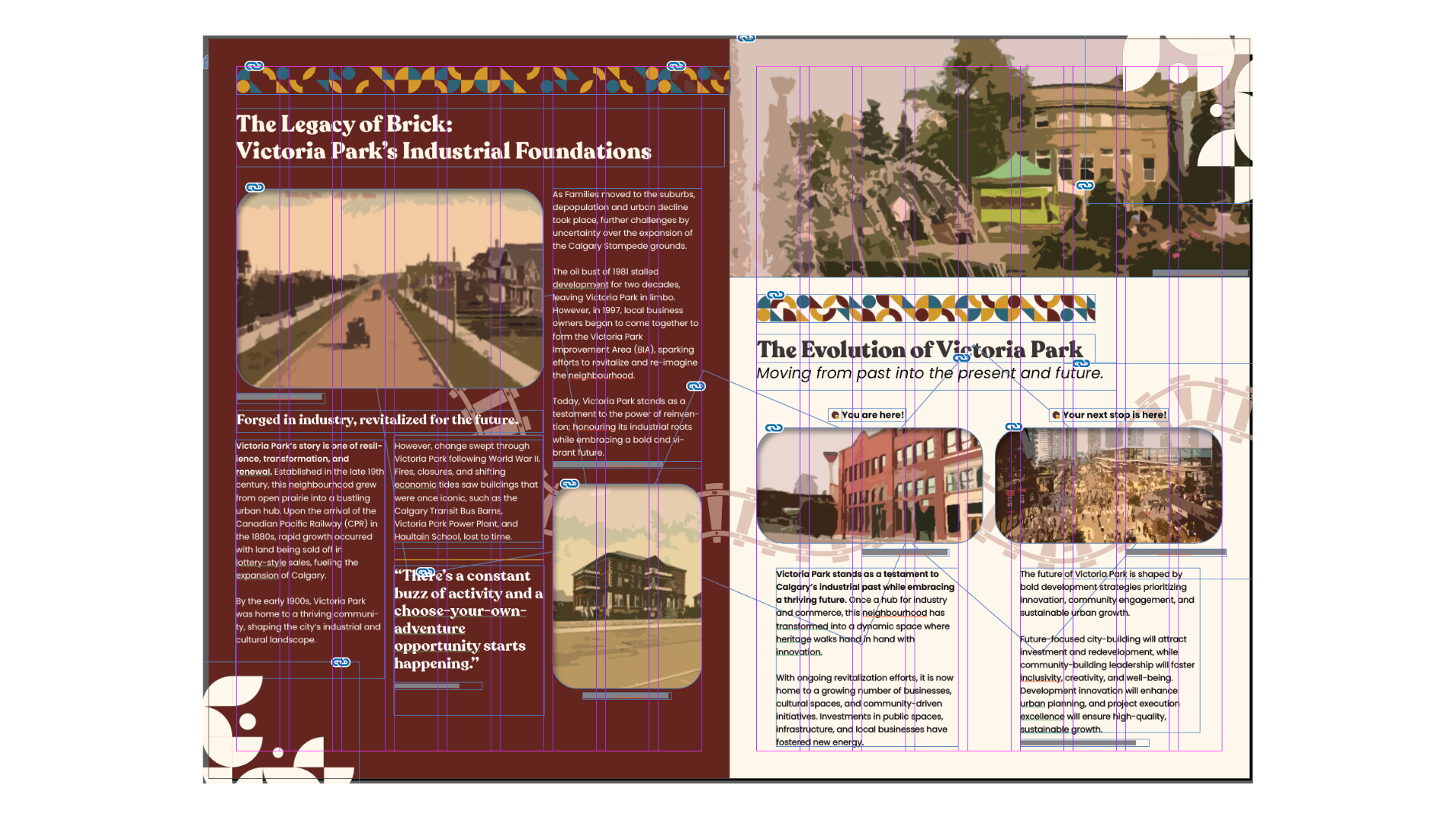
The newsletter served as a print application of the identity system and a tool to inform and engage residents.
Design Priorities:
– Multi-column grid for strong typographic structure
– Custom-designed icons and photo treatments
– Use of white space and alignment to create a sense of openness
– Integration of community stories, a calendar, and local highlights
Each spread was carefully planned to maintain hierarchy, contrast, and rhythm while showcasing real, research-based content.
Click here to view a PDF of the newsletter and check it out yourself!

4. Website Design and Development
Next, I designed a neighbourhood website homepage to show how the identity could scale digitally.
Key features:
– Hero section with Victoria Park imagery and tagline
– Event calendar, business directory, and community updates
– Responsive layout emphasizing accessibility and navigation clarity
– Continuity with the newsletter’s typography and color use
This step emphasized digital cohesion and usability. Click on the image below to visit my website! Or follow this link: https://vicparkdistrict.wixsite.com/my-site-2
5. Infographic Poster
Theme: “A Neighbourhood in Motion”
This data-driven poster explores the evolving identity of Victoria Park through the lens of its young, mobile, and highly connected community. Using census-based data on housing, mobility, and lifestyle, the piece translates key insights into engaging infographics that reflect the neighbourhood’s momentum and transformation.
Designed for public display, the poster uses bold typography, a cohesive grid system, and elements from the Victoria Park visual identity system to create a clear visual narrative. The goal was to bring the brand to life through accessible, community-centered storytelling grounded in real data.
Results and Impact
The final identity system successfully reflected Victoria Park’s character—a balance of historic charm and modern urban life. It was applied consistently across a multi-page newsletter, a website mockup, and a large-format poster. Each deliverable demonstrated how a unified visual language can strengthen community engagement and recognition. Feedback from peers and instructors noted the clarity of the layout, strong typographic hierarchy, and thoughtful use of graphic elements.
Final Thoughts
This project reinforced the importance of combining creative storytelling with accessible, functional design—especially when designing for real communities. I learned how to build and apply a flexible visual identity system grounded in research, and how to maintain consistency across print and digital formats. It also deepened my understanding of how strategic design can communicate values, foster pride, and create a stronger sense of place.


